
As marketers and developers, we’re used to adapting to evolving regulations, from GDPR to privacy-first analytics. Now, it’s time to prepare for another major shift: the European Accessibility Act (EAA), taking effect in June 2025.
While accessibility has long been a best practice, the EAA will soon make it a legal requirement for many organisations, including those who send emails within or into the European Union. If you’re using Mautic to manage email communications, here’s what you need to know.
Importance of EAA and why it matters
The EAA is a directive designed to ensure digital products and services are accessible to people with disabilities. It applies to a wide range of services, including websites, mobile apps, e-commerce platforms… and yes, emails. If your organisation operates within the EU, or targets EU citizens, this law could affect you. Failure to comply may result in legal penalties, loss of trust, or being excluded from public sector partnerships. This is serious stuff.
While the EAA primarily targets larger companies and public sector organisations, small businesses shouldn’t ignore these requirements. Microenterprises, defined as having fewer than 10 employees and an annual turnover below €2M, may be temporarily exempt from certain obligations, but this could change as the regulation evolves, and EU is will known for that.
Being proactive now not only prevents costly future adjustments but also signals a genuine commitment to accessibility and user inclusion from the outset.
How does it affect Mautic users?
Here are some common areas where Mautic users may fall short:
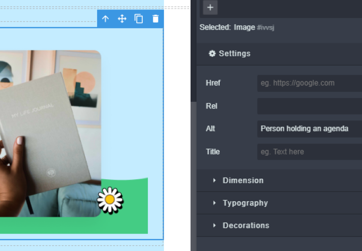
🖼️ Missing alt text for images
Images without descriptive alt attributes can create major barriers for users relying on screen readers. If your email includes buttons, banners, or visual CTAs rendered as images, those users won’t understand their purpose unless meaningful alt text is provided. Mautic users should ensure all image elements include concise, descriptive alternatives.
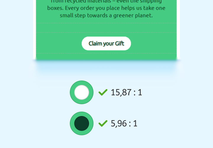
🎨 Poor colour contrast
Text placed over backgrounds, buttons with low contrast, or pastel colour schemes may look elegant, but can be unreadable for users with visual impairments or colour blindness. The EAA requires a minimum contrast ratio of 4.5:1 for normal text, which means design choices need to balance style with readability.
💡 Good structure = better experience
Just like a well-organised blog post or a clear landing page, your email also needs a logical structure, not just for the eye, but for assistive technologies like screen readers.
If your email content isn’t structured clearly in the code (even if it looks fine visually), some users might not be able to read or navigate it properly. For example, screen reader users rely on headings, lists, and content order to understand what’s on the page, and where to go next.
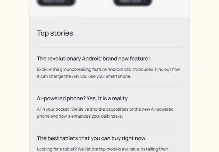
🔗 Unclear or inconsistent navigation
If you’re using Mautic to create onboarding sequences or multi-step forms, navigation must be intuitive and predictable. Users should always understand where a link leads and what the next action is. Keyboard accessibility and screen reader compatibility are especially important here.
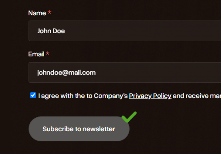
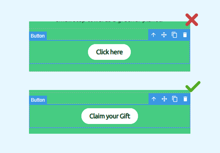
📎 Non-descriptive links (e.g. “click here”)
Generic phrases like “click here” provide no context for screen reader users. Instead, links should describe the destination or action clearly, for example, “Download the accessibility guide” or “View your subscription settings”. This improves both accessibility and usability.
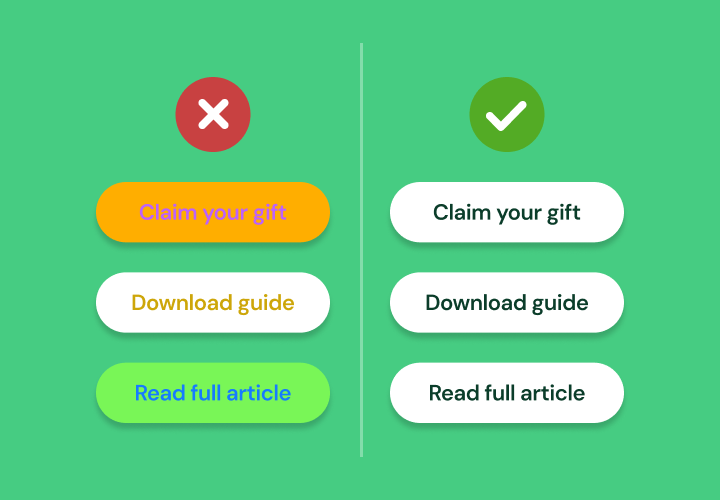
🧭 Inconsistent design can create confusion
When users interact with your emails, they rely on familiar patterns to understand what’s clickable and what action to take next. If your buttons, links, or call-to-actions (CTAs) change appearance from one email to the next, or even within the same email, it can make the experience harder to follow.
Using different colours, shapes, or placements for similar actions forces users to relearn the interface each time, which increases cognitive load and may lead to missed opportunities.
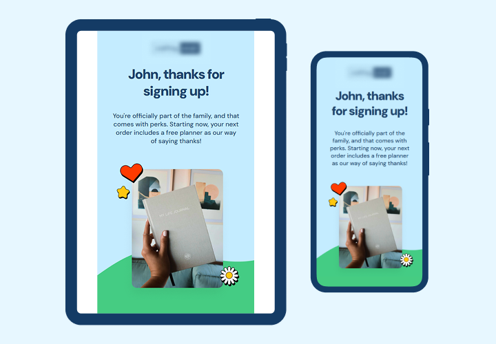
📱 Lack of responsive design
Accessibility isn’t just about screen readers or colour contrast, it’s also about making sure your email is easy to read and interact with, no matter the device.
If your email or landing page layout breaks on small screens, uses tiny text, or forces users to pinch and zoom, that’s a barrier. Many people with disabilities rely on mobile devices, and poorly optimised designs make your content harder to access.
Practical steps you can take
You don’t need to stress, here’s what you can start doing now and from now on:
- Audit your existing templates (email, landing page, form): check for missing alt text, poor contrast, lack of headings, and overall structure.
- Use free tools to test colour contrast and accessibility. There are plenty available online, no need for advanced knowledge. Some useful tools include:
- Ensure responsive design across all assets. Test on both desktop and mobile to guarantee readability and usability.
- Check forms for accessibility: labels, focus states and error messages must be clear and usable.
- Keep interactive elements consistent: same button styles, colours and behaviours across emails, pages and forms.
- Educate your team – designers, developers, marketers – on accessibility principles and the basics of WCAG.
As a community, we help each other!
Accessibility isn’t just a requirement, it’s a shared responsibility, and the good news is that you’re not alone.
If you have questions about the EAA or want feedback on your accessibility efforts, start a thread in the Mautic Forum, the community is here to support you. 💖
A special shout-out to Anderson, whose continuous work on accessibility within Mautic has had a significant impact. From improving screen reader support to refining interface contrast, his contributions show that Mautic is truly committed to aligning with accessibility best practices!
Let’s keep moving in this direction, together.
📘 Official European Parliament Directive (EAA):
Directive (EU) 2019/882 on the accessibility requirements for products and services